
Recently, it just so happened that some members of the community asked me about an exercise I shared on Tableau Public some time ago, so I thought it was the right time to prepare a post detailing the step-by-step required for its construction.
This exercise focuses on the use of Drill Down, an extremely powerful concept that allows information to be broken down into increasingly detailed levels. Specifically, we explored the possibility of going down from the level of regions all the way down to specific states, cities, and ZIP codes.
Throughout this exercise, we will learn how to create a detailed sales information table. In this table, we will integrate Drill Down, allowing the end user to explore the details fluidly and efficiently.
The table will provide the following detailed information:
- Total sales for the last four years.
- A line chart displays annual sales.
- The variation both in total amount and in percentages of last year’s sales vs. sales of the first year.
Additionally, in the exercise we will use a scaffolding technique that will simplify the creation of the distinct levels of the hierarchy in a single table of information.
So, if you are ready to embark on this exciting adventure of building a sales analysis with geographic Drill Down, I invite you to continue reading!
STEP 1. DEFINE THE DATA MODEL REQUIRED TO APPLY THE SCAFFOLDING TECHNIQUE.
We will employ a model, where we will establish a connection between the data source provided by Tableau, known as ‘Superstore’, and a supporting table specifically designed to facilitate the scaffolding process. This scaffolding table contains a single column of data called “Scaffold” that spans values zero through four.
The relationship between both tables will be established using a calculation created specifically for the association with the value ‘TRUE’ in both tables.

STEP 2. DEFINE PARAMETERS..
We will use two essential parameters to record the information about the last choice made by the user. One parameter will be used to store the level of the selected node within the hierarchy tree, while the other will serve to identify the specific branch selected by the user, containing the information of the nodes involved, from the root node to the selected node.
| PARAMETER | TYPE | ALLOWABLE VALUES | CURRENT VALUE |
| Level | Integer | All | 1 |
| Path | String | All | Total» |
STEP 3. DEFINE NEW FIELDS ASSOCIATED WITH THE HIERARCHY.
The purpose of these formulas is to assign generic names to the distinct levels of the geographic hierarchy. It is not a mandatory step, since you have the option of directly using the dimensions that make up the hierarchy if you prefer.
| Data L1 | [Region] |
| Data L2 | [State/Province] |
| Data L3 | [City] |
| Data L4 | IFNULL(STR([Postal Code]), “-“) |
Additionally, we are going to introduce two new fields. The first of them will contain the complete description of each branch of the tree, that is, it will provide detailed information from the root node to the leaf node of each of the branches of the geographic hierarchy tree. In this example, the root node represents the total and gradually moves into regions, states, cities and finally reaches the leaf node that corresponds to a single zip code.
The second field will identify the maximum level of the hierarchy, which will be equal to the number of levels that make up said hierarchy, not including the global or total level. In this example, the maximum level is four.
| Data Hierarchy | “Total»” + [Data L1] + “»” + [Data L2] + “»” + [Data L3] + “»” + [Data L4] + “»” |
| Max Level | 4 |
STEP 4. DEFINE THE FIELDS FOR DRILL DOWN AND DRILL UP.
With the scaffolding technique, the “Scaffold” field offers us the possibility of generating copies of the data based on the selected hierarchical level. A value of zero will show global or total information, while a value of one will show region-level information. This process continues in a phased manner until reaching level four, which corresponds to the zip code within our hierarchical geographic structure.
The new calculations will focus on the creation of fields that provide information related to the branch of the hierarchy to which each option presented belongs. The fields that will be used to update the parameters will also be defined once the user selects an option, which will implicitly be associated with an action of moving forward or backward within the hierarchy. Thus, as the field that will be used as a filter to determine which branches of the hierarchy will be visible based on the choice made by the user.
| DD Path (Current) | LEFT([Data Hierarchy], FINDNTH([Data Hierarchy], “»”, [Scaffold] + 1)) |
| DD Label Prefix | IIF([Scaffold] = 0, “●”, IIF(STARTSWITH([Path], [DD Path (Current)]), IIF([Scaffold] = [Max Level], “←”, “-“), “+”)) |
| DD Label | REPLACE(SPACE([Scaffold] * 5), ” “, CHAR(160)) + [DD Label Prefix] + ” ” + SPLIT([DD Path (Current)], “»”, -2) |
| DD Level (Next) | [Scaffold] + IIF([Scaffold] = [Max Level] OR [DD Label Prefix] = “-“, 0, 1) |
| DD Path (Next) | IIF([DD Label Prefix] = “-” OR [DD Label Prefix] = “←”, LEFT([DD Path (Current)], FINDNTH([DD Path (Current)], “»” , [DD Level (Next)])), [DD Path (Current)]) |
| DD Filter | [Scaffold] <= [Level] AND STARTSWITH([DD Path (Current)], LEFT([Path], LEN([DD Path (Current)]))) |
STEP 5. DEFINE THE FIELDS WE WILL USE IN THE LINE CHART.
Calculate the date in years and the annual sales by branch of the hierarchical tree.
| Year | DATE(DATETRUNC(‘year’, [Order Date])) |
| Min Year | { MIN([Year]) } |
| Max Year | { MAX([Year]) } |
| Sales by Year | {FIXED [DD Path (Current)], [Year] : SUM([Sales])} |
Two reference lines will be defined to guarantee an adequate margin that allows the visualization of the values corresponding to the sales of the initial year and final year in the line graph. These reference lines will be calculated from the minimum and maximum sales values per year, and an additional margin will be added to them to avoid overlapping sales numbers on the graph line.
| Ref Lines Upper | {FIXED [DD Path (Current)] : MAX([Sales by Year]) * 1.5 } // Set the aggregation level to MAX |
| Ref Lines Lower | {FIXED [DD Path (Current)] : MIN([Sales by Year]) } – ([Ref Lines Upper] / 3) // Set the aggregation level to MIN |
When we create a sales line chart, we typically define the axis using the values from the sales field directly. However, in this scenario, the axis will be shared by the different columns of the table. For this reason, it is necessary to use a formula that adapts to the distinct types of columns that we will use, in this case, we use two types of columns.
To set the axis of the line chart, we will use the formula SUM([Sales]). On the other hand, for the remaining columns, we will obtain the axis value, calculating the average value of the two previously defined reference lines. This will allow us to place the text in the center of the axis precisely.
| Axis | IIF(COUNTD([Year]) > 1, (AVG([Ref Lines Lower]) + AVG([Ref Lines Upper])) / 2, SUM([Sales])) |
Fields will be defined for the color and size of the circles used to highlight each year in the line graph.
| Size | [Year] = [Min Year] OR [Year] = [Max Year] |
| Color Dot | IIF(ATTR([Year]) = ATTR([Min Year]), “1-First”, IIF(ATTR([Year]) = ATTR([Max Year]), IIF(SIGN(AVG([Variation $ by Label])) <> -1, “4-Dot Green”, “4-Dot Red”), “2-Middle”)) |
STEP 6. DEFINE FIELDS ASSOCIATED WITH SALES VARIATIONS.
The variation will be determined by comparing the sales of last year vs. those of the first year.
| Variation $ by Label | IIF([Year] = [Max Year], [Sales], IIF([Year] = [Min Year], -[Sales], NULL)) |
| Variation % by Label | SUM([Variation $ by Label]) / SUM(IIF([Year] = [Min Year], [Sales], NULL)) |
| Color | IIF(SIGN(AVG([Variation $ by Label])) <> -1, “1-Dot Green”, “2-Dot Red”) |
STEP 7. DEFINE OTHER SUPPORT FIELDS IN THE VISUALIZATION.
We will establish fields that will allow us to prevent a “mark” from standing out above the others when selected.
| H | H |
| U | U |
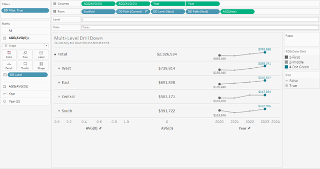
STEP 8. BUILD THE SALES CHART.
Move the “DD Filter” field to the filter shelf and select only the “TRUE” option.
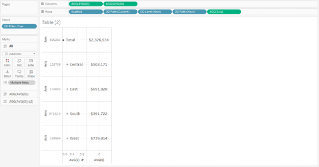
You must ensure that the “Scaffold” field is defined as a dimension.
Move the dimensions: “Scaffold”, “DD Path (Current)”, “DD Level (Next)” and “DD Path (Next) to the row shelf.
Move the “Axis” field to the row shelf.
Edit the axis so that the range is established independently for each row and deselect the option to include the zero value.
Definition of the first column that corresponds to the row label:
- Add the formula “AVG(0)” directly to the column shelf.
- Change to shape graph type and use a transparent shape.
- Set the range of the axis of this column between 0 and 1.
- Move the “DD Label” field to the text shelf.
- Use a Font “Tableau Medium 12”, color #555555.
- Establish “Middle Center” alignment.

Definition of the second column that corresponds to the number of total sales:
- Select the AVG(0) formula with the “CTRL” key and create a copy for a second axis.
- Remove the “DD Label” field from the text shelf.
- Add the “Sales” field to the text shelf.
- Use a Font “Tableau Medium 12”, color #555555.
- Establish “Middle Center” alignment.
- Hide the headers of each of the row shelf fields.
- Deselect the “Show Header” option for each of the four dimensions of the row shelf.
Definition of the third column that corresponds to the line graph with double synchronized axis:
- First axis of the line graph:
- Add the “Year” field to the column shelf and change it to “Exact Date”.
- Add the “MIN(Ref Lines | Lower)” and “MAX(Ref Lines | Upper)” fields to the detail shelf.
- Add two transparent reference lines with the fields MIN(Ref Lines | Lower)” and “MAX(Ref Lines | Upper)” on the “Axis” axis.
- Add the “Sales” field to the text shelf. Edit the text shelf.
- In the text use Font “Tableau Medium 9” color #666666.
- “Bottom Center” Alignment.
- Edit the text and include a blank line before the sales line.
- Adjust so that only the sales value is shown at the beginning of the line, that is, the one that corresponds to the first year.
- Use the color #999999 for the line.
- Second axis of the line graph:
- Add a second copy of the “Year” field to the column shelf. Change to circle chart type.
- The second-year axis must be worked as a dual axis synchronized to the first-year axis and must be changed from a line graph to a circle graph.
- Adjust the range of the year axis to start on #1/7/2019# and end on #1/6/2024# and hide the secondary axis.
- Add the “Size” field to the “Size” shelf and the “Color Dot” field to the color shelf.
- Adjust sizes and colors.
- Add the “Sales” field to the text shelf.
- “Top Center” Alignment.
- Adjust so that only the most recent sales value is displayed, that is, those that correspond to the last year.
- And let the Font match the “marks”.
- Adjust the first two columns again, so that the type of graph is “shape”.
- Adjust the formatting of gridlines and lines to eliminate unnecessary lines.
Definition of the last column that corresponds to the amount of the variations:
- Capture the AVG(0) formula directly into the column shelf.
- Change to shape graph type and use a transparent shape.
- Add the “Variation $ by Label” and “Variation % by Label” fields to the text shelf and use “Tableau Book 11” and “Tableau Book 9” fonts respectively.
- Add the “Color” field to the Color shelf and adjust colors.
- Establish “Middle Center” alignment.
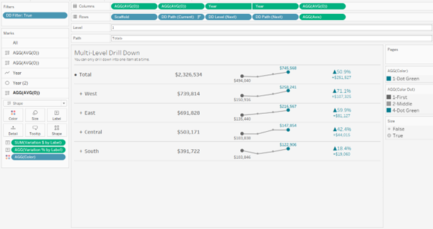
Add the “H” field to the “Detail” shelf of all axes.
STEP 9. DEFINE PARAMETER ACTIONS ON THE DASHBOARD.
| PARAMETER ACTION | SOURCE | TARGET PARAMETER | FIELD OR VALUE | AGGREGATION |
| Level | Table | Level | DD Level (Next) | None |
| Path | Table | Path | DD Path (Next) | None |
STEP 10. DEFINE FILTER ACTIONS ON THE DASHBOARD.
| SOURCE SHEET | TARGET SHEET | FILTER | SOURCE FIELD | TARGET FIELD |
| Table | Table | Selected fields | H | U |
Ready!
Link here.

If you have any questions or comments about the exercise, please do not hesitate to get in touch.
