On March 24 Luke Stanke wrote the following message on Twitter. Wow! The warning thrown by Luke, rather it sounded like: DANGER Will Robinson DANGER!!!
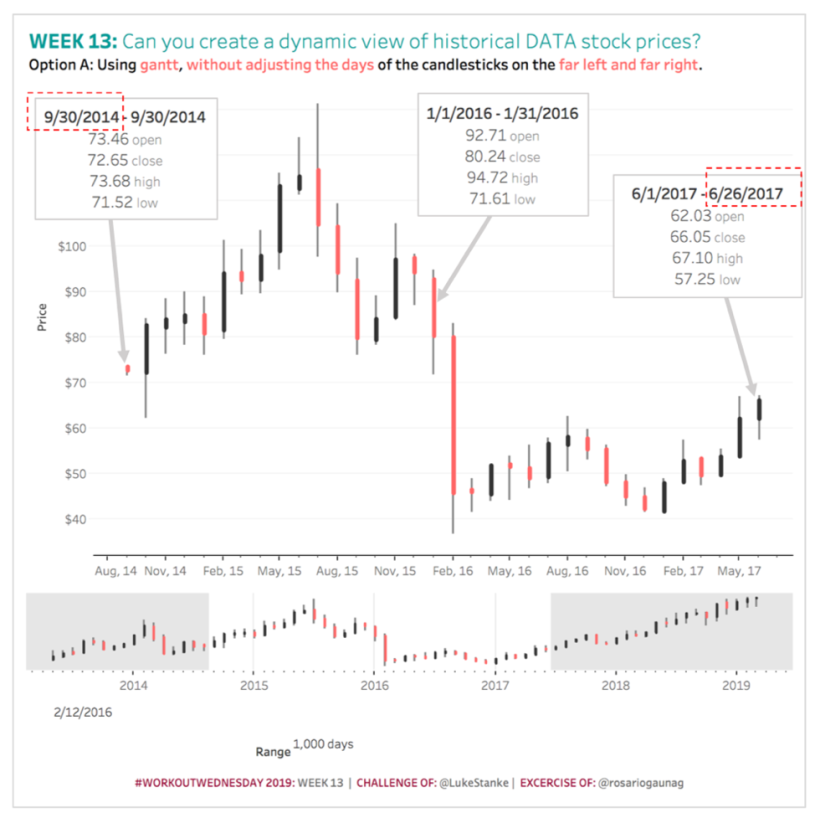
When the challenge of week 13 was published I was able to verify that the warning was not in vain. The challenge consists in creating a dynamic view of the price of the shares, which, depending on the selected range of dates, will present a different level of aggregation:
- Months:When there are more than 20 months of selected dates.
- Weeks:When there are less than 20 months but more than 15 weeks of selected dates.
- Days:When there are less than 15 weeks of selected dates.
This involves managing dynamic periods.
To increase the level of challenge, the requested chart is a candlestick type with the following specifications.
- For the “background” of the candlestick:It must be formed with the following values: 1) The lowest value and 2) The highest value of the share price of the dynamic period.
- For the “first plane” of the candlestick:It must be formed with the following values: 1) The opening value of the first date of the dynamic period and 2) The closing value of the last day of the dynamic period.
- For color:Must show when the closing price is higher or lower than the opening price.
And if you are a lover of challenges and decide to accept the advanced level, you should also include:
- Use rounded corners in the chandeliers.
- Include a second chart that shows all the data but uses reference lines to suggest the range of data that should be shown in the main chart.
Luke says that this challenge can be solved by union the data to themselves or with a Gantt chart. Luke recommended us the use of union the data to themselves. The challenge captivated me and I could not miss the opportunity to try both techniques.
What are the basic ideas or concepts behind each technique:
- Union the data to themselves:The union of the data allows us to have two copies of the data, which gives us the possibility of creating two-line charts: 1) The background line with a copy of the data and 2) The foreground line with the second copy of the data.
- Gantt chart:It has the advantage of only requiring a copy of the data, but the disadvantage that the lines created do not have rounded corners.
This blog is focused to show the steps that I continued looking to work with only a copy of the data and achieve the effect of rounded corners in the lines, using:
- A line chartfor the foreground line of the candlestick and achieve the effect of rounded corners in the thick line.
- A Gantt chartfor the background line of the candlestick, since it is a thin line and in the thin lines at least I, I don’t perceive a critical difference between rounded or unrounded corners and with this, avoid the need for a second copy of the data.
Below I share the steps I followed:
Step 1: Create parameters: “Center” and “Range of days”.
The “Center” parameter will be used to select the date that will be used as the central point of the dates to analyze. It will be defined as a date and the possible values will be each of the dates listed in the data source. Current value: 2/12/2016.
The “Range of days” parameter will be used to indicate the number of days before and after that will be taken from the selected central date. Type “integer” will be defined with a minimum value of 10, a maximum of 2,500 with increments of 10 in 10. Current value: 1,000 days.
Step 2: Create variable “Period” or level of aggregation.
| Period =
IIF({FIXED : COUNTD(DATETRUNC(‘month’, [Date]))} >= 20, “month”, IIF({FIXED : COUNTD(DATETRUNC(‘week’ , [Date]))} >= 15, “week”, “day”)) |
Step 3: Create “Dynamic Date” variable according to the level of aggregation selected.
| Dynamic Date =
DATE( CASE [Period] WHEN “month” THEN DATETRUNC(“month”, [Date]) WHEN “week” THEN DATETRUNC(“week”, [Date]) WHEN “day” THEN [Date] END) |
Step 4: Create the variable “Filter”
It will have the value of TRUE for those dates that meet the conditions of being between the selected dates according to the values of the parameters defined in step 1.
| Filter =
[Date] >= [Center] – CEILING([Range of days] / 2) AND [Date] <= [Center] + CEILING([Range of days] / 2) |
Step 5: Create the variables for the candlestick background.
The background line of the candlestick should be formed considering the following values: 1) The lowest value and 2) The highest value of the share price of the dynamic period.
| Start of Background Candlestick =
MIN([Low]) |
| Size of Background Candlestick =
MAX([High]) – MIN([Low]) |
| End of Background Candlestick =
MAX([High]) |
Step 6: Create the variables for the foreground of the candlestick.
The line of the foreground of the candlestick should be formed considering the following values: 1) The opening value of the first date of the dynamic period and 2) The closing value of the last day of the dynamic period.
| Start of Foreground Candlestick =
{FIXED [Dynamic Date] : MIN(IIF([Date] = {FIXED [Dynamic Date] : MIN([Date])}, [Open], NULL))} |
| End of Foreground Candlestick =
{FIXED [Dynamic Date] : MAX(IIF([Date] = {FIXED [Dynamic Date] : MAX([Date])}, [Close], NULL))} |
Step 7: Create the variable “Color”.
| Color =
AVG([End of Foreground Candlestick]) >= AVG([Start of Foreground Candlestick]) |
Step 8: Create the labels on the tooltips to indicate start and end days in each “mark”.
The first and last period plotted are adjusted with the minimum and maximum dates selected in the parameters of step 1.
| Start of Dynamic Date =
MAX({FIXED : MIN([Date])}, [Dynamic Date]) |
| End of Dynamic Date =
MIN({FIXED : MAX([Date])}, DATE( CASE [Period] WHEN “month” THEN DATEADD(“month”, 1, [Dynamic Date]) – 1 WHEN “week” THEN DATEADD(“week”, 1, [Dynamic Date]) – 1 WHEN “day” THEN [Date] END)) |
Step 9: Create the chart with synchronized double axis.
Remember that we will use a Gantt chart for the background line of the candlestick and a line chart for the foreground line of the candlestick, to give the effect of rounded corners.
Move to the shelves of:
- Filter ⬅
Filter: True and convert it to context filter and with the right click select the option “Add to Context”
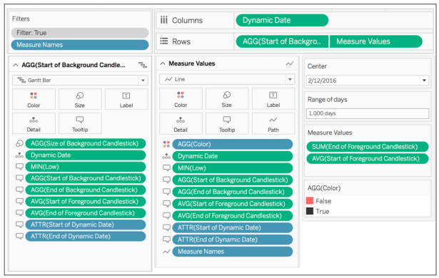
“Measure Names” and select “Start of Foreground Candlestick” and “End of Foreground Candlestick”
- Columns ⬅ “Dynamic Date” use “Exact Date” and “Continuous”
- Rows ⬅ “Start of Background Candlestick”
- Detail ⬅ Dynamic Date
For the Gantt chart add the variable “Size of Candlestick Background” to the “Size” shelf
For the Line chart add the variable “Color” to the shelf of Color and the variable “Measure Names” to the shelf of “Path”
The Gantt chart is used gray color and the line chart uses the red color for “False” and the black color for “True”
Add the fields indicated in the following image to the “Tooltips” shelf

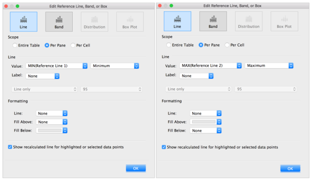
For the advanced level, a second chart should be created that shows all the data but uses reference lines to suggest the range of data that should be shown in the main chart.
Step 10: Calculate the reference lines for the second chart, in case you have accepted the challenge at an advanced level.
| Reference Line 1 =
DATE(DATETRUNC(“month”, [Center] – CEILING([Range of days] / 2)) – 15) |
| Reference Line 2 =
DATE(DATETRUNC(“month”, [Center] + CEILING([Range of days] / 2)) + 15) |
Step 11: Construct the secondary chart, following a logic similar to the main chart.
For the advanced level, a second chart should be created that shows all the data (without using a filter in the data) that includes the use of reference lines to suggest the range of data that should be shown in the main chart.

Ready!
Link to Tableau Public  Thank you Luke for sharing this incredible challenge, full of multiple challenges. Big fun!
If you have any questions about the blog, do not hesitate to contact me on Twitter (@rosariogaunag)
Regards!
Rosario Gauna
